I started by adding a new rug from Ikea. After that, I put some curtains on those naked windows. The chandelier was changed to a new nickel one, I made a sunburst mirror, and finally re-arranged the table to make room for a future buffet to go under the mirror. It's a room that isn't used much but I like it to at least look good.
The living room was a blank slate but I think we got it going now.
A pair of accent chairs were the start of this room. I picked this pair because they picked up most of the colors we were using throughout the downstairs. I eventually added curtains to match the ones from the dining room. The room became a little more defined with a new sofa. Next to the sofa is a cute little red table that I found at none other than Target. The last step was to add some more color to the room. Since the main accent color in the house is blue, the wall behind the sofa became blue. It refreshes the space and sets it apart from the adjoining dining room. There are still some more pieces to add this year like art behind the sofa and a rug but I feel better that the room isn't empty anymore.
I'll say the biggest transformation in 2012 was the kitchen.
The first change was adding a tile backsplash. It gave the kitchen a little character. The major change was painting the cabinets. We went from light to dark within a week and the difference is crazy. We are still marveling at the change. It's like we got a new kitchen for a fraction of the price. The last change to the kitchen was the lights. We changed out the two boxy florescents for recessed lights and pendants over the island.
One of the rooms that wasn't touched was the guest room.
We were holding off on buying furniture for the space not knowing if we were truly going to have overnight guests rolling through. But in 2012 we learned this room would become a nursery! So excited for the paint to go on and bring new life into the room.
There were more projects throughout the year that I loved.
The master bathroom went from blah to better with a coat of blue paint.
We later added frames to the mirrors for a more custom look.
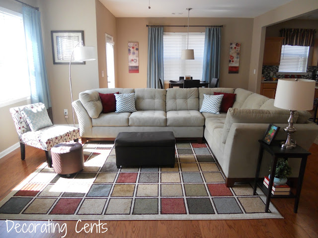
The family room got a new look with a lighter sectional.
The striped curtains from a shower curtain made a big statement in the office.
Some smaller projects included making paper mache letters, paint chip art, DIY West Elm Spheres, a monogram step stool for my daughter's room, and coasters from tiles and scrapbook paper.
I definitely look forward to what 2013 has in store. There's always room for improvement. There are plenty more rooms to go and more tweaks to make.
Are you ready for 2013?
Sharing with
DIY Showoff * It's So Very Cheri * Making the World Cuter * The Gunny Sack * Under the Table and Dreaming * Crafty Confessions * A Bowl Full of Lemons *


0 comments:
Post a Comment